UX Specialist  |  Researcher

Passionate UX designer focused on human behaviour.
Author: Hello Human: The 10 Participant Personas in UX Research

About me

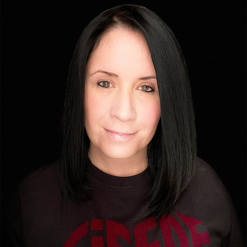
Adele Meijers - UX Research Specialist

Hi there! I’m Adele Meijers.

I'm a UX Research Lead, and absolutely love what I do!

Human behaviour studies excites me and I have real passion for UX and UX Research as it really does carry great value for businesses when implemented and executed correctly. A big part of this passion for UX, is of course planning and conducting usability interviews and UX Research. I enjoy meeting new and interesting people during research and usability studies, finding out what they like and don’t like and then bringing their message back into business to improve or expand on the product or offering or idea tested.

I am listed as a mentor on ADPList where I help fellow or aspiring UX Designers and UX Researchers with portfolio reviews, general career advise or more detailed requests like how to correctly approach and conduct a specific research study and how to prepare for it. I never stop learning in this vast, exciting field of UX and design.

I conduct online workshops and speak at conferences nationally, Internationally and online.

Conferences, workshops, mentoring:

  • UXSA 2021 Online Conference | South Africa – Watch talk HERE
  • World Usability Conference – In Person - 2022 | Graz, Austria – See my speaker information HERE
  • Book a session with me on ADPList HERE

Everyone loves free gooddies, right!
I have a free Stakeholder Interview template for you to use when preparing for a project. More templates will be loaded soon so keep an eye on this page.

Download FREE Stakeholder Interview Template

Hello Human: The 10 Participant Personas in UX Research

Better understand your participants, users, clients and humans overall

Hello Human provides extremely interesting profiled participant information about the different types of people one might meet. The 10 UX Research personas, compiled by studies and interview data Adele has completed, has been carefully planned and laid out based on multiple participant similarities, identical characteristics and behaviours which form part of a combination of specifics like general human behaviour, personality types, tone of voice, body language as well as overall appearance and mannerisms.

This guide will greatly assist current or aspiring UX professionals who want to know more about how to conduct UX research and studies to better understand their participants as well as professionals who want to understand their clients better.

In this book, you will be introduced to the 10 personas you would most likely meet in your research studies, interviews or clients you deal with on a regular basis:

The Chatty One who enters the room with a burst of personality and colour;
The Quiet One who comes across as shy and introverted;
The Nervous One who needs a bit of reassurance to help them relax;
The Overly Confident One that will fill the chair with their charisma and energy;
The Bossy One with their strong personality and even stronger will;
The Secret Admirer taking more interest in you than the study without you even knowing it;
The Angry One who really just wants to be heard having gone through an awful customer experience;
The Buffering One taking the time to painstakingly think before they answer;
The Valentine oozing chivalry and flirtation; and
The Gold Digger who knows how the system works and that they’re only there for the reward and couldn’t care any less about your product or feature.

HOW TO ORDER YOUR COPY

Outside South Africa: Order your digital copy (Kindle and other) or printed copy from Amazon: ORDER HERE.

In South Africa: Order a printed copy delivered to your door ORDER HERE.

Download a sneak peek chapter of Hello Human: The 10 Participant Personas in UX Research, below.

Download sneak peek chapter

Adele Meijers - Hello Human The 10 Participant Personas in UX Research

WHAT I SPECIALISE IN

Understanding Human Behavior

I have a passion for people. As a UX Specialist, it really helps to have a deep understanding of how people think, behave and interact with products or services. By really getting behind the user’s needs, wants and understanding what motivates and drives users is the real answer behind crafting effective and user friendly designs and products.

Conducting Usability Studies

Planning and executing usability studies (qualitative or quantitative), studying (interviewing) participants and compiling study findings feedback in such a way that everyone can understand it is crucial for every project. Ask the critical questions, listen to and observe users.

Doing UX Research

Research conducted correctly and fully always reveal valuable information. We have a choice in the research types to be conducted and its always a good idea to ensure all areas are covered, even the non-competitors. There is always something to learn from others successes and mistakes.


Would you like to know more or need something specific?

Contact me

Work experience

Current and previous work experience

Adobe Certified Educator
CAPM Project Management Certified
CompTIA CTT+ Classroom Trainer
HFI - Certified Usability Analyst
HFI - Certified Usability Specialist
Microsoft Certified Professional

UX Portfolio

When tasked to design a new product or improve on an existing one, the challenge lies in finding that perfect balanced solution between the user needs, the product design, and the business requirements. My approach is to get to the granular details of the problem and immerse myself in the design process.

×

Savings calculator

Improved UX on Savings Calculator

I was tasked to improve the UX and flow (keeping in mind the different product selection options available) on the existing savings calculator for the company's rewards programme. This savings calculator is used to see what a customer's savings is and compare it to what it could be if the customer is on a higher rewards level and also shows what activities are required in order to reach that level. The higher the rewards level, the better the savings and the more their cash-back rewards are for the customer.

THE TEAM

  • Digital Manager – Lize Korff
  • UI Designer – Pamela Duursema
  • UX Specialist – Adele Meijers (Me)
  • Front End Dev team (Agile team that rotates on projects)
  • MY ROLE

    I took the problem statement and dissect it by looking at the current screens that are live, find out why it was designed that way and look at any data or previous research or usability testing that was done on this specific project and make notes of any errors found and comments made by the customers, if any, to learn from and improve on.

    TOOLS

  • Axure RP8 – low fidelity wire frame screen designs and creating click-through prototype
  • Adobe Illustrator CC – layout design
  • Adobe Photoshop CC – layout.
  • THE PROBLEM STATEMENT

    Customers are struggling with the current calculator layout to easily find exactly what steps they need to complete in order to improve their status and move up a level. They also want a clear view of what product offerings they need to take up in order to improve their score without committing to the product as yet. This means they need to have a view with a selection of choices to see what they want and don't want and how to proceed with minimal thinking, effort and with the least amount of friction.

    HYPOTHESIS

    By giving a customer control and freedom of choice to navigate, select and learn about the products of the company and what they need in order to advance to a higher level, they will be more trusting and willing to move through the journey and commit to the products or solutions proposed to them.

    THE SOLUTION

    Depending on the selection the customer makes, their options will change and they can see their savings in a report screen. There's a few different scenarios built into this calculator to give the customer the freedom of choice.

    The revised, simpler, step-by-step view of what the results page would look like once the customer has completed all required steps in the calculator is easier and clearer to understand. The customer will be able to see the different savings amounts across all statuses and will be able to action required steps in order to improve. By strategically and clearly placing a "next best action" for the customer as well as well written and placed call to action buttons will assist the customer to make a quick informed decision and proceed to on-board to their chosen product. Also this view gives the customer the opportunity to change their current selections in order to view different outcomes and results. The customer is placed completely in control of their choices and can play around with the calculator to see what their savings could be on each status. At the end, the option to download and file the report is readily available to the customer should they wish to file and keep their calculations and plan locally where it is easily accessible or by logging back onto their account.

    THE PROCESS

  • Research
  • Compare
  • Redesign (many iterations)
  • Guerrilla test with customers
  • Refine further
  • Test again and send proposed wireframes for consideration to the team.
  • PERSONAS

    Existing personas derived from previous studies were kept in mind when tackling this task but no new personas were created for this specific project. These personas were existing, new- and aspiring customers coming to or making use of the online platform be it a returning existing customer, a newly on-boarded customer or a potential customer looking at their options and thinking of taking up the product.

    REQUIREMENTS

    The main requirement was to make the savings calculator clear and fun to use. To give the customer a current and future view and to help the customer to their next-best-action to achieve their goal.

    UX RECOMMENDED SOLUTION

    Applying a step-by-step user flow, we were able to create a fun and engaging calculator that allows one action at a time with a clear beginning and end. The customer is able to move back and forth and to play with the options available to see what they need to do or have in order to improve on their current rewards level tier.

    THE DESIGN/WIRE FRAMING

    The revised, simpler, step-by-step view of what the results page would look like once the user has completed all required steps in the calculator is easier and clearer to understand. The user will be able to see the different savings amounts across all statuses and will be able to action required steps in order to improve. By strategically and clearly placing a "next best action" for the user as well as well written and placed call to action buttons will assist the user to make a quick informed decision and proceed to on-board to their chosen product. Also this view gives the user the opportunity to change their current selections in order to view different outcomes and results. The user is placed completely in control of their choices and can play around with the calculator to see what their savings could be on each status. At the end, the option to download and file the report is readily available to the user should they wish to file and keep their calculations and plan locally where it is easily accessible or by logging back onto their account.

    OUTCOMES AND LEARNINGS

    Do not give the customer too many options at once. The reason is clear, customers become stressed or annoyed even as they just want to see what the best option is for them, tailored by them, and they want to be able to make an informed decision. If we design with this in mind and test with our customers early in the process, we will be able to iterate faster and get to a well-designed experience sooner.

    Redesign - Cloud Billing

    Improve on billing solution.

    I carefully tested and designed this user flow to help the user to follow the steps correctly, with the added choice of adding or removing certain options filters to make the buying or payment process easier to navigate. By adding in-line prompts to guide the user in making a decision to either proceed with that specific step or not. This will minimise error rates and a back or cancel button is supplied to allow the user a way to safely back out of the choice made.

    1. To do a full UX evaluation of current UI and supply a full UX Recommendation solution document.
    2. To create an easy and user friendly way to check billing system success and failure rates.

    The current user interface is difficult to learn and navigate. Although the software does what it's supposed to, and does it well, the company's billing agents (the users) reported finding it difficult to learn how to use the software quickly.

    The UX process

    I conducted an in-depth UX analysis on the current billing system and compared it to a similar kind of billing system. I compared ease of use and accessibility and did a hieuristic evaluation of the user interface.

    I unfortunately didn't have the opportunity to interview the company's users that use the actual software which made it a lot more difficult to do the redesign but I did do a usability analysis and derived my findings and solution from the analysis findings.

    • Low fedility wireframing helped me quickly point out certain problem areas
    • A UI overhaul of the interface and clean-up of the Information Architecture
    • I tested on four users to see if they would navigate the programme easily.
    • From the user test findings I applied some selected iterations.
    • From the user test findings I applied some iterations.
    • I presented the final usability recording to the company stakeholders.

    The presentation of the software prototype was well received and I got some valuable feedback which was noted in the product documents. A full product redesign report and user manual was submitted with the new design proposal.

    Low fidelity wireframes

    Responsive mobile screens.

    When we first started, we unfortunately did not use the mobile first approach and had the desktop version of the site up and running first. The reason for this is because planning a trip to travel abroad requires research and a lot of reading and decision making. Research have shown that users prefer bigger screen and desktop device to do more important tasks where their mobile devices are rather used for smaller tasks, while moving or if the user wants to quickly check an email or do a social media post.

    I was tasked to take the existing desktop version website and convert it to a mobile version. I approached this massive task by first drawing the low fidelity wireframes to see what the responsive mobile look would look like and to identify what elements must be forced to sit correctly when viewing the site on a mobile device to ensure the experience stays the same and the screens still look familiar to the user when moving between devices. The website was built using Bootstrap 3 on Rubymine and later adapted for mobile screens (responsive) by making use of the supplied wireframes and following UX recommendations closely.

    The UX and UI design process

    1. I reworked the desktop screens and created mobile wireframes.
    2. I had to ensure that call to action buttons are correctly placed and easy to reach for both left and right handed users.
    3. I kept 'fat finger first' principle in mind for mobile users when deciding on button sizes.
    4. The mobile version's images and icons had to be well optimised to ensure fast loading with the least amount of data. We re-used elements and pictures where we could to also speed up loading and save data and space.
    5. I made use of icomoon to create a custom icon font family file for the site's icons. This helped significantly with lighter and faster load times and have no repeat icons wasting valuable data and space.

    Guerilla testing with a few users with different backgrounds and technical abilities showed that the screens would be well received, although some users did worry about the data and how heavy the site would be to load on their mobile devices due to the heavy use of images. I made sure to note this concern to the team.

    One of the more difficult challenges experienced during the mobile version was the search function. We had to look into different ways to use less screen realestate while still giving the user the full support of search and filter options that's easy enough to use on a smaller mobile device. This, we believe, was solved by using a filter option that allows the user to make use of quick tap and select options. Once the first choise is made the second option is automatically loaded for the user to select from and the search results results changes live on screen below the search for the user to see as they complete their search journey.


    Unfortunately Kizzler closed down due to lack of funding before the project could be completed.

    Register online

    Redesign online member registration form

    PROJECT OVERVIEW

    The previous online registration form that users had to complete proved to be a big pain point with many drop-offs indicated and a low successful completion rate captured. We have found that this was due to the confusing interface and badly worded form fields that has minimal explanation and guidance making it difficult for the user to understand exactly what information they should give and why certain personal information is needed.

    THE PROBLEM STATEMENT

    Customers are struggling with the current online registration form and the success rate is very low when comparing the total amount of visitors to the page. Upon reviewing the page and copy, it was found that the tone was not very user friendly and didn’t quite speak to the customer. The steps given to the user feels disjointed and tedious.

    REQUIREMENTS

    The main requirement was to make the process easier to use and understand and to open up a user-friendly path so that the user will close the loop on the end-to-end journey by completing their signup and creating their profile.

    HYPOTHESIS

    When a user feels confident in their decision and can easily find an answer to their questions they would be more likely to move through the signup process successfully.

    THE TEAM

  • Digital Manager – Lize Korff
  • UI Designer – Pamela Duursema
  • UX Specialist – Adele Meijers (Me)
  • Front End Dev team (Agile team that rotates on projects)
  • MY ROLE

    I took the problem statement and dissect it by looking at the current screens that are live, find out why it was designed that way and look at any data or previous research or usability testing that was done on this specific project and make notes of any errors found and comments made by the users, if any, to learn from and improve on.

    THE PROCESS

    I looked at a few options on how to approach this task and decided to conduct an empathy map activity on the current registration form to see what the user thinks and feels when they work through the screen. From measuring the user's intent before visiting the site and deciding to see if they can or want to join, to reading the first paragraph all the way to tapping the Join Now button. This exercise is extremely valuable when you want to get a view of what your users think and feel while navigating your website. The user’s emotional scale will slide up and down as they go through the experience. It is natural because hard decisions need to be made, sometimes very important decisions that might frighten the user slightly or delight them in a way. If we have a clear view of what our users think and feel, we are better able to adapt our design and experience to ensure they go through a seamless journey and have all the necessary information that will help guide them to make the right decisions.

    By doing this emotional mapping on this screen, we were able to identify pain points, friction areas and copy that wasn't clear enough or confusing or causing angst in the user. We mapped these points and then pulled the screen apart bit by bit, taking great care in reviewing what the task is and why the user might feel frustrated, confused, happy, sad and we aimed to improve on this.

    TOOLS USED

  • Axure RP8 – low fidelity wire frame screen designs and creating click-through prototype
  • Adobe Illustrator CC – layout design
  • Adobe Photoshop CC – layout.
  • ACTIVITIES

    Research, comparison studies, redesign (many iterations), guerrilla test with users for rapid feedback, refine further, test again and send proposed wireframes for consideration to the team.

    VALUE PROP & RESEARCH

    I looked at and researched competitors both local and international to compare their online on-boarding process to ours. I also looked at non-competitors and also compared their on-boarding to our current on-boarding process. The research was conducted by making notes when posing as a new client on the site and I put myself in the user’s shoes when going through the flow and screens, making notes of pain points and moments of delight that I experienced. I found that when a product is explained and the value in taking that product up is shown upfront to me, that I as a user will find it easier to go through the long process of filling out forms and completing tedious tasks in order to create my profile. I kept this in mind throughout every company I researched and made a list of good, bad, ideal, non-ideal, needed and wasted information given and mapped it on levels of emotion and made notes of where a user might feel uncomfortable and stop the process versus where they would get excited and tell everyone else about it.

    PERSONAS

    Existing personas derived from previous studies (not done by me) were kept in mind when tackling this task but no new personas were created for this specific project. These personas were existing, new- and aspiring customers coming to or making use of the online platform be it a returning existing customer, a newly on-boarded customer or a potential customer looking at their options and thinking of taking up the product.

    KEY INSIGHTS

    If a user’s questions aren’t answered on the spot or they aren’t given an FAQ section or an online chat feature, they might not complete the process as they might feel uncomfortable and have unanswered questions and so not completely confident in their decision if they want to complete the process of signing up or not. Copy and content is extremely important and selling the value to the customer early in their journey to ensure the on-boarding process is completed without fear or friction.

    APPLICATION & IMPROVEMENT

    By taking the research findings, verbal feedback and data and making small tweaks to the user interface, we will be able to deliver a lighter experience with friendlier copy that triggers excitement for the user. Also if we look at customer complaints, requests on social media and feedback received from newly on-boarded customers, we found that by clearly explaining and showing (making use of well written and to-the-point copy as well as images that relay the message) users will move through the process faster and more confidently.

    THE REDESIGN

    By mapping the emotional state of the user from long before they open the website link all the way to when they have completed the first part of finding out if they are eligible to on-board, I was able to strategically place copy and form fields at the right place and at the right time when it makes sense to the user while keeping it light and delightful and fun to move through the process. The wire frames you see here are high fidelity.

    OUTCOMES & LEARNINGS

    When we make things easy to understand and not too much to read, users will be more likely to complete a process BUT it is also important to provide the lengthy explanatory copy and terms and conditions in an easy-to-reach place for those users who does read. *As I have sat through many usability studies and user interviews, by both observation as well as asking, it is clear that there are users who prefer to read or skim terms and conditions and FAQs. When asked why, users say they look for catches and key words to make sure they aren’t getting themselves into trouble or signing something they might regret later.

    *I have a whole case study on this specific finding piece which I have shared in posts on UXology’s Instagram page. You can have a look at it HERE.

    UX ROI & VALIDATION

    It’s important to measure improvements and how future improvements will be documented. We make use of on-boarding and signup data from the data team to track how many users visits the online registration form vs how many complete the process to see if the new and improved layout works or not. This can usually be seen over a 6 week span of tracking visitation data. Based on this we will see if further changes are required and if we might invite 10-15 newly on-boarded customers to usability interviews to get their view on their experience of on-boarding by making use of the digital format of registering and UX recommendations and changes will be logged from those findings.

    Logo design

    Vivid Consulting

    One project request that always get me excited is when a customer asks for a new logo design. This just makes my insides tingle with ideas and excitement. This specific logo is a very personal one as it had to match the customer's vivid personality but still match the brief accordingly of being professional. I thought long and hard and did quite a bit of research while also asking the client MANY questions and presented a few logos before finally landing on this concept.

    The thinking behind the sliced logo wasn't just to show the very balanced play between business and fun but also the funky bright colours, font choice and application had to be rigid enough to stand the test of time to last a while before a refreshing of brand or identity is needed (I mean even Apple and Google and Pepsi and Cocacola refreshes their brands to make sure they keep up with the times) and my aim here was to have it as current and futuristic as possible but also easy enough to adapt successfully for both print and digital use.

    You can have a look at Vivid's website and read more about what they do (and they do it WELL) and follow them on instagram below.

    Visit Website Follow on Instagram

    KDC

    Kids clothing line characters

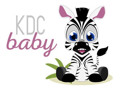
    Like most UX designers I know, I stem from a strong design and illustration background. I feel that, although for a UX Professional it's not necessary, having this strong creative side really helped me throughout my career. When I'm not interviewing users or doing UX work, I absolutely love to keep busy with side projects, like these, that challenge me on a different level. This project was done for KDC Clothing. They are based in South Africa and distribute their beautiful range of clothing (for kids and adults), bedding etc globally.

    I was asked to create a Zebra character from the African Big-Five for a kids clothing line. So this cute little guy was born and along with him, is big-five brothers and sisters followed to complete the collection. These characters, completely hand drawn (vector) in Adobe Illustrator CC, was printed on the most beautiful pieces of cloth and sewn into the cutest little-people wear! I really thoroughly enjoyed this challenging project and along with the input from the customer, these little guys came out pretty amazing. Flat illustration but with so much character.

    I hope you like them as much as I do.

    UX Research Process

    How I do UX Research

    How I do Usability Interviews and Research Studies

    The most important step of any project for any business, no matter how big or small and no matter where in the product cycle you are, is to test your screens, flows, concept, idea, launched and live product AND copy with your users (and non-users).

    I prefer to do research and testing throughout the lifecycle of the project. Even if we are in the middle of a screen design and someone has a cool idea or feature they think might add value. TEST IT! Every person on the team (if you work in a team) has their own ideas and insights and experience to bring to the table so it is important to get both internal and external input. At the end of the day WE are also a user or a customer of a brand or business and each individual has gone through both good and bad experiences in the past. Related or non-related to what you are designing. Any and all experiences count and we can learn from past successes and mistakes.

    LISTEN

    I do not start a project or look at anything unless I have spoked to the team or individual and asked my questions and listened to what they have to say. This is a VERY important step. is to listen!

    LEARN

    Whenever I get put on a new project or get pulled into an existing or ongoing project, I LEARN as much as I possibly can (with the amount of time I get given) about the project, the team on the project and anything related to this project. Now you think 'come on, you surely don't do this for EACH and EVERY little thing?'. My answer is YES! It takes a simple email introduction (when working remotely) or a Teams call or a face-to-face meetup to just get familiar with what it is that you are working with. Also when I come back onto a project I review and recap to make sure I don't confuse myself (being pulled accross the organisation and touching on many producthouses' work confusion can happen very quickly).

    TAKE NOTE

    I have what I call my repository. It's more notes than anything else. I document as much as possible digitally because it's searchable. Its easier to find something by typing a key word than paging through pages and pages of notes in diaries.

    START THE PROCESS

    Thanks to HFI's CUA & CXA courses I have managed to design and develop my own UX Process map. This map is a living document (which you will find here on my website under FREE) that I update regularly as new processes are developed or discovered. Mine is broken up into three sections.

    UX PROCESS

  • Research Process
  • Design Process (UX/UI)
  • Validation Process
  • In the Research Process, I cover everything from the kick-off meeting, Project assessment, Data Analysis to Stakeholder Interviews (and many more). This phase differ for each and every project and my process map can be tailored to exactly each type of project, no matter how far or how early in the lifecycle it is. There are very important steps that needs to happen early on in order to ensure that the project will one day launch to be a success and that you are able to track your work and hopefully be able to show the return on investment to the company (or yourself). Growth is very important and make note of learnings, failures and findings here.

    In the Design Process I track from brainstorming with the team, to creating the first wire frame to building the high fidelity prototype to test with customers. In this phase a LOT happens and also this is where the UX Copywriting comes in (another hot topic lately).

    Not lastly but the third phase is Validation. Here I seperate it from the usability testing in the Design phase simply because you are now validating a product that has gone live and you keep a VERY close eye on it and pull it back for further iteration and improvements because NO PROJECT IS EVERY COMPLETE and you will always have something to improve on as long as you have a user at the end of it.

    USABILITY STUDIES

    I don't like to call these interviews or user interviews simply because the term 'interview' causes feelings of fear in some, so, I prefer to call it a study because this is what we do here. We study the subject, we study the user/customer and we study the findings. It's all about learning, disecting and applying.

    Typically when conducting a study I break it up into four sections:

  • Welcome and introduction
  • Pre-study questions
  • The main study (either interview only or a mix with a prototype)
  • Closing and rating
  • I thoroughly explain these sections clearly to the participant in the beginning and always allow time for light hearted chit-chat before getting down to the work. I have found that this is the best way to put the user at ease and to build trust. When you spend an hour with someone in close proximity talking about something very specific you want that person to be very open and honest with you BUT you also want them to enjoy the session - as well as you because we sound like broken records, repeating the same thing over and over for a few days in a row. Might as well make it fun. Build trust and build relationship and show you're really interested in what they have to say (you have to be interested otherwise you need to rethink what it is you're doing!).

    Talking to people vs watching them is two completely different things and I would recommend reading up on body language and micro reactions if you're thinking of taking this part of UX Research seriously. It takes time to learn because everyone is different bus also so much the same.

    UX Workshop Session

    Thinking outside the box

    A different approach to workshopping

    I KNOW I'm not the only UX designer that has experienced this before. You sit behind your computer, fiddling away with your wire framing or UI layout for hours. Eventually when you have a good prototype or something to show you take it to the team, VERY excited about your creation, only for your work to be pulled apart with comments on things that you weren't even aware of. Right? Frustrating! I know. Well, here's how I tackled this issue and it really did work!

    Banking App - Possible Funds screen.

    I went back and forth about seven times on the same screen. That is ONE screen where the task was quite simple: "Users don't understand what they are looking at. Make it easier for the user to understand and use". Ok! I sat down, pulled the existing screen apart, had a look at what was previously designed and compared it to what is currently live, put my earphones on and away I went. I did my research, designed a beautifully user friendly layout with motivations of why I'm proposing the specific design, showed it to the team...and there it is, changes, again. A very important feature was placed too far below the scroll and needed to move up because of its importance. Ok, noted, so I did that and of course that means something else has to bow the knee and move down...wrong again! This went on back and fort (I do like these sessions because you can really get into the heads of the stakeholders and product owner and see why they do the things they do - which helps me as a UX Specialist to balance that back to what the user wants and needs). The problem is, this is wasting time. Valuable time. Not just mine (and the company has to pay my salary for the hours I spend) but that of the customer also.

    So my solution? Simple! PRINT! WHITE BOARD!

    That's right! I printed the entire screen but I created 'slices' (guess who has a background in front end development...) and cut the elements out. I popped over to the nearest office supply store and grabbed a few cheap white boards in A4 size and some markers. I then arranged an hour workshop and made sure I was well prepped. When the team walked in, including the product owner, they were excited to see that this wasn't going to be a normal meeting. I had everyone stand around the table. Everyone grabbed a marker and whiteboard and I instructed everyone to draw what THEY think the screen should look like and I took photos of their layouts with my phone. I then scattered the pieces of cut up interface on the table and let them physically move the cut outs around. This made for some GREAT engagement and conversation. Decisions were made and input was given. It went quick and the layout changed about ten more times. But the difference was an hour later an entire team, and product owner, walk out of a boardroom very very pleased. Everyone had their own professional explanation and everyone's opinion was heard. The end product was a screen that was WELL thought through. A layout that was WELL debated and I was able to quickly digitise the design and off I went to do some guerilla testing to validate the new screen layout with users - yes internal empoyees but they are also customers of the bank and they too make use of the app. (I do test with an external audience also where formal customers and non-customers are recruited and invited to take part in usability studies).

    Yes, working digitally is awesome and it's easy to send an email and record comments, but honestly, sometimes it REALLY helps to go back to good old pen and paper - with a twist - and get the room talking and interacting and engaging. UX and UI is not something that is done in silo! It is not something owned by one person. It's about the product, the business and, most importantly, the user!

    Contact me